
Making client connections seamless
CONTEXT
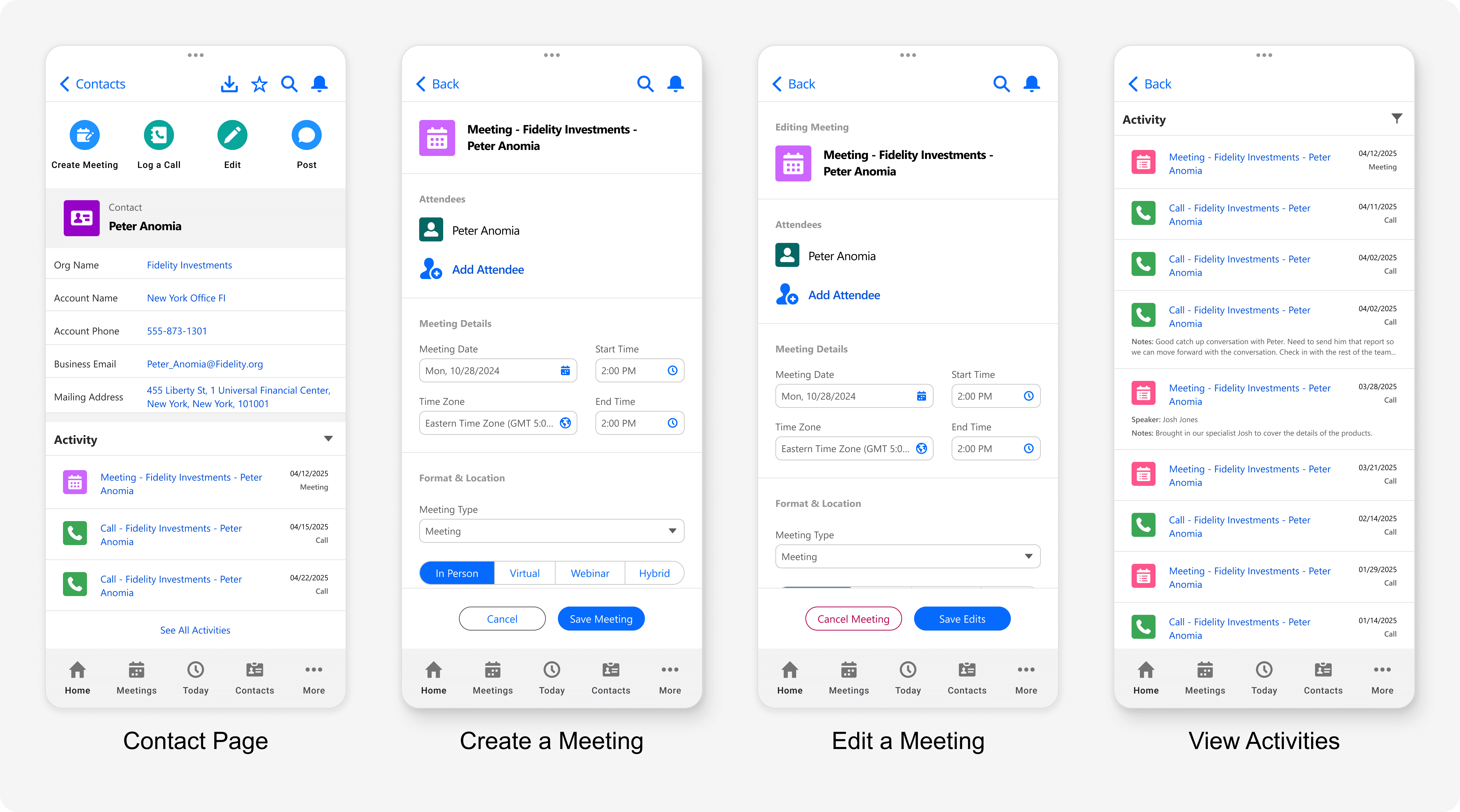
The mobile app of the client's sales CRM suffered from a slow, clunky process to create meetings that was poorly optimized for phones. This poor experience led to frustrated users who avoided the app altogether, as well as frequent input errors, missing information, and a reliance on secretary services to fill in gaps. These inefficiencies not only hindered productivity but also diminished the app’s perceived value among the team.
THE FINAL SOLUTION
A complete redesign of the mobile experience for creating meetings and viewing client activities, leading to a more efficient workflow.
Timeline
6 Weeks
My Role
Responsible for all design and research activities, from designing wireframes to conducting usability testing with a high fidelity prototype.
Team Makeup
UX Designer (Me)
Design Lead
Developers x2
Product Manager
Program Manager
Impact of the New Designs
Dramatically Simplified Workflow: The redesign reduced the number of interactions required to create a meeting from over 35 steps to just 7, saving time and effort for users.
Exceptional Ease of Use: The new designs achieved an average rating of 6.5 out of 7 from participants when they were asked to evaluate the ease of creating a meeting with the new design.
UNDERSTANDING THE PROBLEM
Problems With The Old Experience
Overwhelming Complexity: Users were presented with a dense form containing numerous irrelevant fields, creating cognitive overload.
Unnecessary Interactions: All fields had to be manually filled out, requiring excessive taps and scrolling.
Poor Mobile Optimization: Controls were small, crowded, and overlapping, causing dexterity and input errors.

WHO DO WE CARE ABOUT?
Understanding the External Sales Lead
To redesign this feature effectively, I needed to better understand the sale's lead; so I turned to a previous research study and worked with SME's to piece together a picture of who they are, what their days are like, and what they care about.
External Sales Leads work in high-pressure, fast-paced environments, often multitasking or on the move. Their primary goals when using the app are to:
Quickly schedule client meetings.
Review past client activities for context before a meeting.
Update information with minimal effort between or after meetings.

Goals
Become a reliable opartner who consistently provides value to their clients
Meet their quarterly sales and activity (meetings, calls, etc.) targets
Key Context
Constantly moving from one client meeting to another
They never seem to have enough time for everything
DESIGN
Starting Design by Defining My Goals
To guide the redesign, I defined two clear goals that directly addressed user pain points and aligned with the overall businesses goals:
Reduce Interactions
Simplify the process of creating a meeting by minimizing the number of required user actions. My goal was to make creating a meeting so effortless that users could complete it seamlessly, even on the go.
Optimize for Mobile
Tailor the experience specifically for mobile devices, ensuring an intuitive experience. The redesign would give users a streamlined, mobile-friendly workflow that aligned with their fast-paced needs.
Streamlining the Experience with 3 Key Questions: Who, When, and Where
Understanding the sales team’s primary goal—to get client activities on the calendar—I honed the redesign to focus on answering just three essential questions:
Who is going to be at the meeting?
When will the meeting happen?
Where will the meeting take place?
To accomplish this I:
Removed unnecessary fields that weren’t related to these focus areas.
Worked with developers to prefill certain defaults, like the contact’s name and address, supporting a streamlined workflow.

Reducing Information Overload for Better At a Glance Insights
Before meeting with a client, external salespeople needed a quick way to review recent activities to prepare for their conversation. Their goal was clear: in under two minutes, they needed to understand when they last connected with the client and what was discussed.
In redesigning the activity timeline (the record of past and upcoming client interactions) I prioritized clarity and speed. The new design focuses solely on the key details salespeople need to rapidly identify an activity and understand its context.
For users requiring deeper information, a simple tap allows them to access a more detailed view of any specific activity. This balance ensures that users aren’t overwhelmed with unnecessary details but still have quick access to comprehensive insights when needed.

USABILITY TESTING
Validating & Improving the Designs Through Usability Testing
Usability Study Objectives
The usability study aimed to validate the redesigned wireframes with end users while gathering actionable feedback to refine the designs.
The specific objectives were to:
Assess general usability and ease of use.
Determine whether the designs effectively support the core user goals and align with their mental models.
Methodology
The study employed moderated usability testing with 5 external salespeople. Each session lasted 60 minutes and utilized high fidelity interactive prototypes of the redesigned workflows.
Participant Criteria
Participants were selected based on their relevance to the user base: external salespeople with at least six months of experience in their role and some familiarity with the current mobile CRM app.
Positive Feedback Validated the Direction, but Revealed Areas for Improvement
Participants responded positively to the streamlined and intuitive flow for creating meetings. The focus on "Who, When, and Where" aligned with their mental model, validating the new design direction.
Key Challenges Identified
Despite the overall positive feedback, some participants encountered challenges when trying to take action on created meetings. These included:
Label Clarity: Certain labels did not align with users’ expectations, leading to confusion.
Icon Misunderstandings: The selected icons failed to effectively communicate their intended functionality.
“It’s just 4 lines on the screen… This is how I think about meetings: Who it is, where it is, when it is. It was simple and straightforward.” - P4
“Less is more, just make it quick and easy!” - P3
"This gives me just the right amount of information to prepare for a meeting without wasting time." - P6
Iterating for Clarity and Usability
During usability testing, 3 out of 5 participants struggled to understand the purpose of the original "Cancel Meeting" and "Edit Meeting" icons. The icons were perceived as ambiguous, and participants expected cancellation controls to be located within the "Edit Meeting" flow.
To address this:
The "Cancel Meeting" option was relocated under the "Edit Meeting" flow to align with user expectations.
Clearer, more intuitive icons were introduced to improve recognition and usability.
Annotated screenshots highlight the evolution of the design from the original to the updated version.

REFLECTION
Taking Away Two Key Design Lessons
The Importance of Understanding the User’s Context
The users of this app are always on the move, rushing from one client meeting to another. Anything that slows them down gets discarded. The best designs are those that seamlessly fit into their fast paced day, whether it’s creating a meeting with their hands full or reviewing a client’s history during an elevator ride. This redesign prioritized deeply understanding these moments and crafting solutions that truly support users where and how they work.
Tailoring Design to the Use Case
While cross-device consistency is a cornerstone of good design, optimizing for the unique needs of each device can sometimes mean intentionally breaking from that principle. For this mobile app, it meant removing unnecessary fields to streamline the experience for on-the-go users. As a next step, revisiting desktop usage to evaluate which fields are still relevant and which are outdated could further align the platform with user needs across devices.
